anzeigen
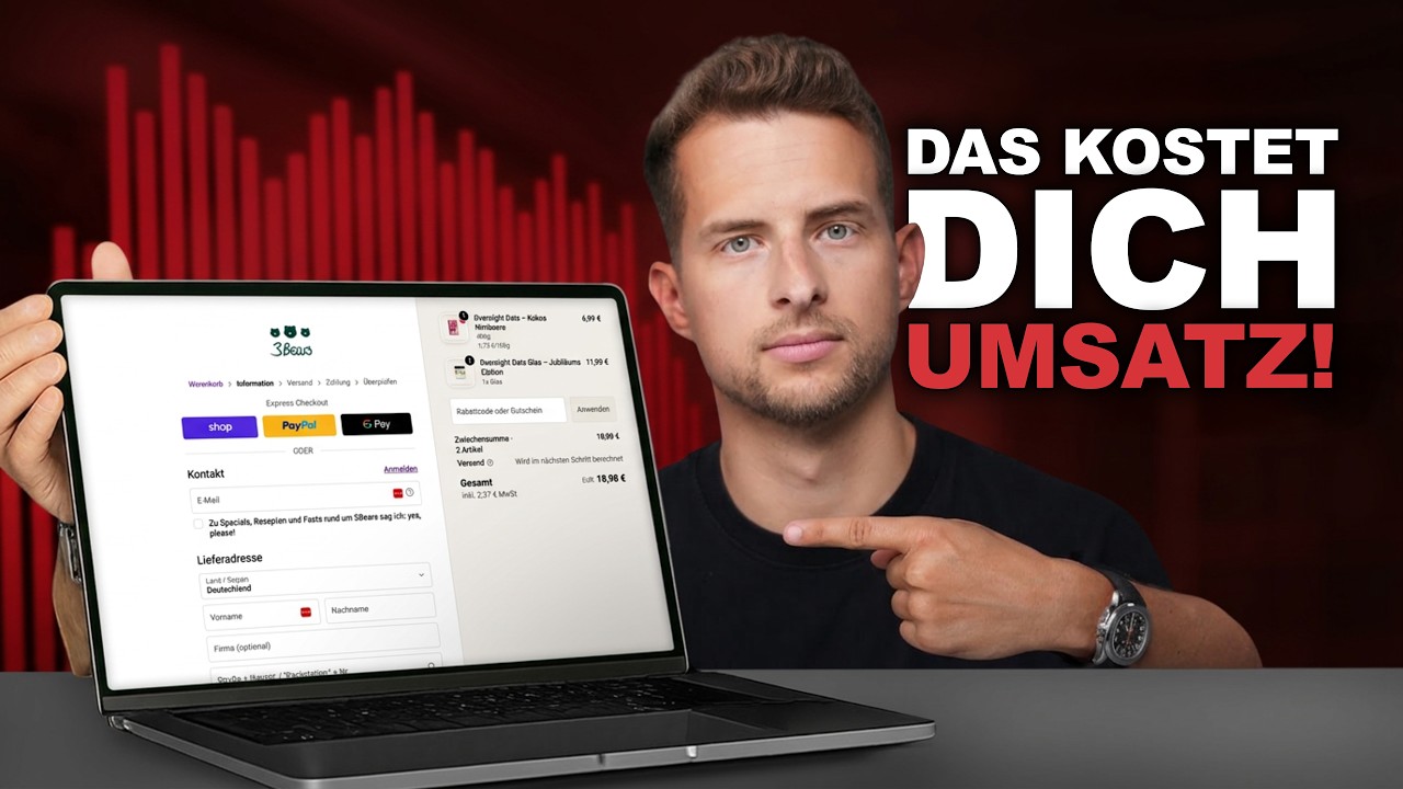
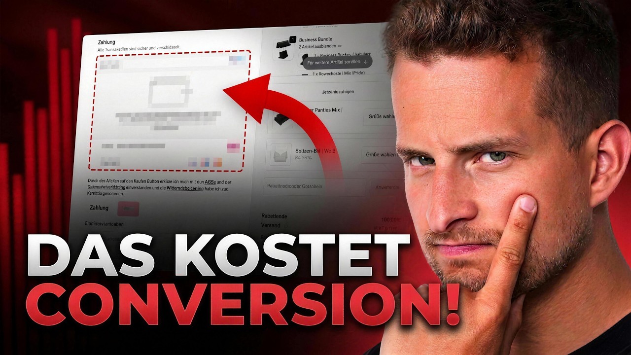
Today we're taking a look at the next online shop from one of the startups that received the most attention from investors, namely Free Bear. Free Beers sells oat products online and was already in the Lion's Den in 2017. Back then, with a turnover of €160,000, Frank Tilen and Junit Williams invested, and last year they made €15 million in revenue, and since 2024 [music] Harry Kane has also been on board as an investor and brand ambassador at Prebes. Today we're going to take a look at an online shop and see what can be improved. Hi, I'm Kevin, Head of Online Shop at the SNX Group and responsible for the online shops of Snocks Oceans Apart, Lely Lyn and Femtis. And today we're going to take a look at Freebers, what can we improve here? With experience from over 400 A/B tests with our brands, we know exactly what works, what converts, and what can be improved in an online shop. Like every online shop analysis, I start on Google and always search for the brand first, to see if the brand has done its homework on Google correctly . What looks very good so far is that we have a Google My Business listing here when you search for the brand. This means we have a very prominent page in Google search results. That's great. And I always look for the two main keywords. I always search for brands using the keyword " experience" to see if the brand itself lists for this keyword, as it is one of the most frequently entered keywords in connection with the brand. What we see immediately is that they list Trustp first, fortunately with good ratings of 4.5, then Riff is IO, and only then does the Freebers site come up, listing it here with its homepage. That means there is no dedicated user review page. There's definitely room for improvement in order to list at the top and attract customers to your own shop. The second keyword, as always, is discount code in conjunction with the brand name, as listed here. She's listed first. This is really very good compared to the relevant discount sites that are listed further down here. However, I already looked at this beforehand and I can see directly that it lists an empty category. Unfortunately, although the customer is taken directly back to the shop via the first result , they do not find a particularly good search result for their query. There is definitely room for improvement with a dedicated discount page that offers customers a discount, for example, for their first purchase. Now let's jump directly to the homepage and see what awaits us there. We just saw the cookie banner . It looks good at first glance. Very prominent here in the center. Even if we jump to the mobile shop, it really overlays the entire page and you can't do anything without clicking on the Mac, which means that customers definitely have to at least click on the accept or decline button here. One could certainly optimize things by making the acceptance option a bit more prominent here. Of course, it's always also a bit of a philosophical question what one wants to do. Otherwise, the homepage looks really nice at first glance . We have an announcement bar up here with various USPS free shipping offers above a certain threshold, as well as free gifts above a certain threshold and various subscription savings plans offered here. So, we really have some good USPs here. What does the whole mobile setup look like? Likewise, like a continuous banner here with USBs. I think that's great. Otherwise, we really have a very prominent header bar here, which is very wide, also due to the wide Freebers logo. I have to say, because everything is sticky, it's actually too wide. Especially here in the desktop version, that's really a lot. On mobile devices, the whole thing is also sticky, even not quite as wide, but it's still a very large area if you have a small device . I would consider not making the ones that can be found sticky. We've already seen the next step a few times, so we'll stay on this page for a moment; it's the Exit Intent. If I scroll down here, I have to say it really does appear very, very early. So, we've just seen him three times. I think I just clicked it away. Perhaps that's why he no longer appears. What I find very good is that he has an incentive, i.e., a 10% discount was offered. Here it is again, if you register for the Nüss. However, he appears very, very quickly. So, an exit intent. We conducted various tests . It should always include an incentive to entice customers to use it. And he shouldn't pop up too early. The customer might have bought it anyway. Only after 45 seconds, or when leaving the page, especially on desktop, should such an exit intent be displayed. Otherwise, let's stay within the menu for now. We have the logo here on the left side, which I think is great. And we have all the categories here. I must say, I think this shop navigation is great. Here again, products are featured. However, I find that otherwise the announcement bar or menu bar is very cluttered. Here we have the "About Us" section with various points. We talked about our products, then recipes again, last chances. I think I would tidy things up a bit here , put more emphasis on the top-selling categories, and move some of these items to the footer instead of directly into the header bar up here. I think the banner here with video is great. We just saw Harry Kane, too . Uh, so here trust is already being generated through famous personalities who are associated with the brand . Otherwise, we have the shopping cart here on the right-hand side; let's open that. There's still a lot more potential here . Teacher shopping cart. At least there's a "continue shopping" button here. So something is happening here, but you could also directly feature products, bestsellers, and offer something to the account when it's added to the learning cart. The same thing happens when searching . It also opens on the side. I think that's very good too. One could consider this, as it already has many products. I would probably display the search function in its default expanded state here. We can quickly jump over here to see what the whole mobile looks like, just to have a look. But here too, the search function is not expanded by default. I would always do that for a certain number of products , so that they are displayed expanded by default and, especially, that search suggestions are shown when you open them. So, to be clear, I haven't entered anything yet. Results could be shown here right now. Bestsellers, so as not to show the customer a blank page, but to directly feature products. Let's jump back to the homepage now. We've really presented quite a lot here. Super. First, here are some best-selling products, which is always very good. Do we have any further categories or features in general, just to see what's available? An overview. And down here we have another trust section with the various people who represent the brand, such as Harry Kane, Sally from Sallyy's World, Serge Knabri and Sarah Harrison. So here are some faces, very well-known ones, that represent the brand. Then below we have more recipes, which are certainly very relevant for the brand, and further information about the brand. So, there's really a lot going on here on the homepage . How many people will scroll down further is another question , but it certainly works. Customers who really want to find out more will find a lot of information here. And down here above the footer we also have a newsletter section, similar to Max Exit Internet Instant with the 10% discount. That's really great. The food is also very tidy. Here again with all the payment methods and all the important links. What I really miss in the forum is that recently they have to offer a direct way to cancel the contract . Ah, we have the button here, but it's not very prominent. I would take another close look at how prominently it needs to be presented. It shouldn't just be a simple link in the foreground; you really need to provide a button that's accessible from every page . That's already the case with the food, but it has to be a button. To be honest, I think he needs to be presented a bit more prominently . But that shouldn't stop us now. Let's jump to a category page and take a look at what such a category looks like at Freebars . And I must say, I find that really, really good. We have a lot of crossed-out prices here. We have savings right here at the top, we have product reviews, so collecting even more would certainly help . So, only one review here is of course very, very little, as we might be actively collecting reviews, but we really do have a very good product page. We always include the price per 100g directly here . This is also always very, very good for consumer products or anything that can be specified in units of measurement. That makes the price seem even lower . What I don't particularly like is that we show shipping costs and VAT prices directly everywhere here. Uh, that has to be shown on the product price, but it could also be included in the product description here , so that it doesn't have to be shown on every single product card . And I would n't necessarily display the shipping costs, that's obvious. I would always focus more on communicating the benefits here. We have displayed free shipping for €45 here instead of adding shipping costs to each product card . What does it mean? What are the shipping costs? And if the customer clicks here, a long list of shipping conditions will open. That's definitely rather off-putting. I think I would do that differently. We can directly add products to the card via the Quick Aducard feature. I think that's great, I must say. Especially with products where you can quickly add the products to your shopping cart instead of going to the product page. We have another sales section here where we can directly select a larger quantity and add it to the shopping cart. I also find that very, very exciting if it works well. Of course, I could cancel now, even though I was just about to lay the Wkop, but if I can manage another abs here, I think that's great. Otherwise, what I find a bit lacking on the category page are filter options. There's still room for improvement there , perhaps also displaying how many products are in this category. So, while we do have the option to sort by various criteria , we can neither filter nor see how many products are actually available on the category page, which is always very helpful for the customer . Am I scrolling through the entire page here, or not? Do I want to filter or not? And as we can see, there are quite a few products, there's even a second side, and that definitely makes sense. Let's jump to a best-selling product. Let's take a look right here at what's featured on the homepage and have a look at the product page. Here is the product image section on the left side, which we can scroll through. We can also take a closer look at them. Let's take a look at what the whole mobile device looks like. I always find that makes it much more exciting. Here you can swipe through the images. USB connections could definitely still be used here. In this picture we have some USB drives on it, but the rest are just pictures for now. Either directly in the images or, for example, below here, you could also work with USBs. We can also enlarge the images. However, I must say I would need to test it on a mobile device. At first glance, the image looks just as small as when I see it up here, uh, how well it actually works. Perhaps you can zoom better on mobile devices in this section, then it might make sense. Otherwise, if the images are the same size, I would say it's better to remove the feature . And then we'll jump back to the desktop view. Like I said, it's great here. You can also click on it and land directly on the rating section. We already have the price, the price per 100g. That's very good. Same issue here. Plus shipping. What does that mean? I would write it here much more readily. Including VAT and free shipping on orders over €45, to frame that positively. Then we have a delivery time of approximately three working days. That's very good, of course. I would consider whether to package that directly via Aducat, instead of displaying it so high up here . This might get lost in the shuffle . Then we have some more product information. Additionally, you can select the variety here. I also think the flapping technique is very good , I must say. Precisely because there are so many different varieties. When we switch, we also see the corresponding other images. That's very, very good. And we always have the opportunity to have fun right here . Saving only 3% here is of course relatively little considering you're buying a four-pack . Let's see if the price updates directly up here. He does. So in the end, we're saving 97 cents here, which is relatively little. If someone here opts for the four-pack, I would consider offering a higher discount, because that would certainly be very beneficial for Freebs if customers choose a larger pack. Alternatively, you also have the option to directly change the number here. I would perhaps try to combine them instead of having two sets of switchers here. We have the Aduc button here, and this section next to it is also sticky. That's pretty cool. We have featured combination products . Let's click the Adcat button now. What happens next? The card opens. We'll take a closer look at that in a moment. Below you'll find more information, and we also have a lot of A+ content. A difficult topic for discussion always arises here if you scroll further down, including the content and ratings. We have a sticky Aducard button here; there's probably a mobile version of it too. I have to say, I've seen it not work very, very often. I would definitely test AB to see if it's really useful. Most importantly, I no longer get the mobile option here. I can click on "Inkopf" here now, but I no longer get the option to choose how much, which type, or whether I want to go for this value pack. That's why, yes, I'm not a big fan of sticky adcards . I'd like to challenge that. That would at least provide a test result to see if the whole thing works. Otherwise, before we jump into the card , let's take another look at the call-to-action buttons. At first glance, it looks very, very good. So, we have the same call- to-action button everywhere in the shopping cart on the homepage and also here on the product pages in the shopping cart. I must say, I don't mind the additional sections, which make it look a little different. You could use the same color, but perhaps it would be too prominent if they were placed directly on top of each other. From that perspective, I would say it's fine as is . Looking at the card, I have to say I find the progress bar up here very, very cool, where we can see directly that from a certain threshold we get free shipping, but further on we even get a free gift, to add more and more products in a slightly gamified way. It also happens automatically when I add products here; the progress bar at the top is then updated. However, it's a shame that if I exceed this value here , it also says up here that shipping is free and then immediately reaches the next threshold, but there's a free gift. Despite this, the amount shown below still includes shipping costs, even though I already have free shipping, as suggested above. This could also be adjusted and displayed directly here. Otherwise, we have some sales directly on the card. That's a difficult topic too. It always depends on the brand. I'd like to challenge it. However, I can imagine that, especially with products in this price category, it could work very well. The Conton looks the same here too. This text could be improved. Instead of just saying "Checkout," you could communicate security here, for example, using the text "Safely to checkout now," which is often used and adds a certain trust factor, assuring you that the whole process is secure. And now let 's jump to the checkout. The very first thing I noticed here is that we're also on Shopify, but we're still in the multi-page checkout and not the new one-page checkout. This used to be the absolute standard; you can see here that the checkout has four levels. So, we have information here about the address and so on, shipping methods, payment methods, and then we end up in the verification step, and nowadays the one-page stackout, which is much faster and only needs to load one page, is the absolute standard. Therefore, I would recommend everyone switch to the one-page checkout to make the checkout process significantly shorter. Furthermore, as we can see directly here, we also have Google Pay active, uh, the Express Checkout data, which is great in principle to use, but virtually no one in Germany actually uses Google Pay. Here we are below 2% usage. Therefore, I would always deactivate Google Pay to keep the selection smaller. Otherwise, let's try skipping through the checkout process here. Another thing that could be done to keep the fields a bit shorter is to display either the company field or the address supplement , instead of both. Both are optional fields, but definitely not both are necessary. Uh, can you hide one of them, and can you also write both pieces of information into the same field? What we'll look at right away is whether there's an address verification process in place. That looks good so far. If you forget the house number, for example, you ca n't skip ahead. That's great. This should always be implemented. For example, with Address Hero you can ensure that exactly this happens, requiring both street and house number to be specified, and that the address is verified again afterwards. Let's skip through the multistep checkout process now . They end up here during shipping. That looks great! It is also stated here that it is being shipped with DHL. Theoretically, the text here could be made a bit shorter, because "free" is already mentioned at the back, so delete "free shipping" and only mention the shipping method "shipping with DHL". And now let's jump to the payments. There is still room for improvement here, namely we can also sort the payment methods here . Credit card is currently selected, but in Germany it's usually the least used payment method; depending on the product, it's almost always PayPal or Claner, and the payment methods should be sorted accordingly. This means that the shop will probably offer PayPal, then Kander, then credit card, and the first payment method displayed will be automatically pre-selected. Ideally, the customer should be given the option to pre-select the payment method they are most likely to use. This can all be done with Payment Hero, allowing you to analyze which payment methods your customers use in each market, in which country if you are active in several countries, and sort the payment methods accordingly for each country. Otherwise, this is the last step of the multi-step checkout. I would definitely turn off the verification step. So we see that if we complete the order here , we will still end up in the review step, where we can see all the information again. This used to be standard practice, but it often means that the customer doesn't understand that the purchase is not yet complete. He thinks he's already done it, especially because if you pay with PayPal here, for example, you authorize the order, and after the PayPal payment you land on the verification step again, and if you don't click on "Complete Purchase" again, the purchase will be cancelled even though you have already authorized the payment with PayPal. This is of course the worst case scenario, so disabling the verification step and clicking directly on "Complete Purchase" is a huge conversion opportunity . There is still considerable potential for optimization in the Freebs checkout process to make it shorter, clearer and faster . Otherwise, we're pretty much finished with the entire online shop. These are my quick tips for optimizing your online shop. The first ideas that came to mind. It's naturally different for every online shop , but with our four online shops SNX, Ocean Support, Lyn and Femtest, we've already conducted over 400 A/B tests, and therefore we have the experience to know what converts, what can be improved in the online shop, and if you now want Johannes and me to take a look at your online shop and do an analysis and tell you exactly step by step what you can optimize, then check out the video description. There you will find a link to the online shop analyses at Klapital and you can book an online shop analysis. Then we'll take a look at your online shop and give you individual tips for your shop.